Please note that this blog post was published on June 2015, so depending on when you read it, certain parts might be out of date. Unfortunately, I can't always keep these posts fully up to date to ensure the information remains accurate.
- My Test Page
- Understanding the Default Behavior
- Understanding What the "-webkit-overflow-scrolling" CSS Rule Does
- The User Needs to Wait Until the Rubber-Band Effect Finishes
- How to Prevent the Background Page from Scrolling
- How to prevent the over scrolling to the background page
- How to Prevent Overscrolling to the Background Page
- Entire Page Source Code
In order to fix a recent scrolling problem in Safari on iOS, I was forced to create my own simple test page and then apply all the information and combinations I could find on the internet to try to resolve the issue.
Below is a brief overview of what I discovered during this process.
My Test Page
My test page was fairly basic. It consisted of mock data in a static div to represent the "page", along with a fixed div to represent an overlaid "menu" above the page, like this.
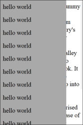
The full source code for the page can be found at the bottom of this blog post.
Understanding the Default Behavior
The first thing I did was try to understand the default behavior of Safari on iOS. The most notable observation was that when you scrolled all the way to the bottom of the menu, the page's body exhibited a "rubber-band effect" - a hard-coded feature in Safari.
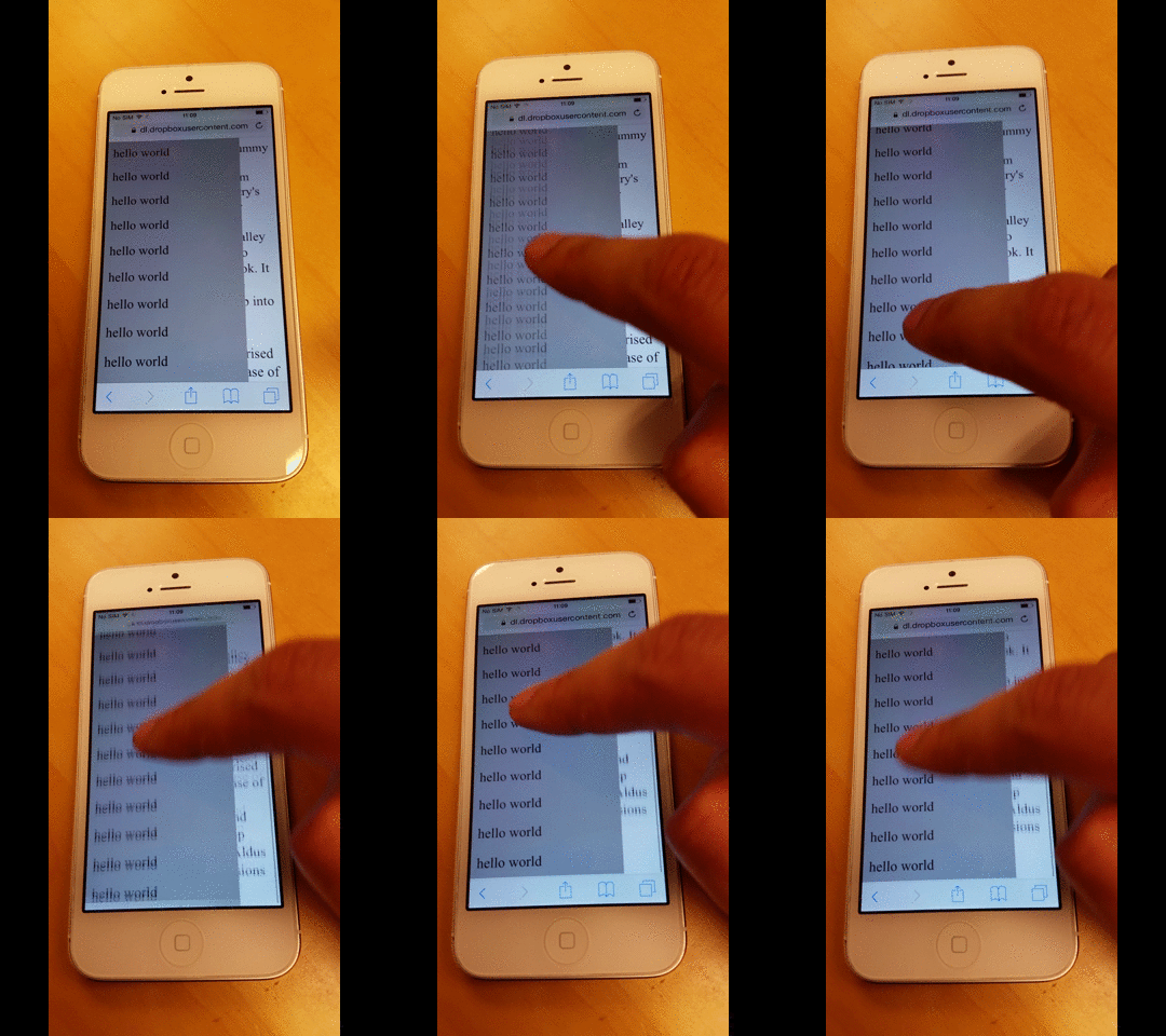
The same thing happened when scrolling to the very top of the menu.
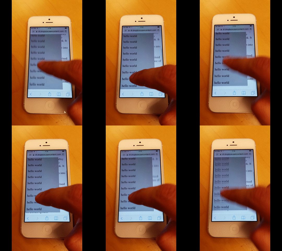
However, the first problem I noticed was that if you continuously scroll to the very top or bottom, Safari begins to show rendering glitches in both the background page and the menu.
I'm not sure why, but I suspect it has something to do with the rubber-band feature.
Understanding What the "-webkit-overflow-scrolling" CSS Rule Does
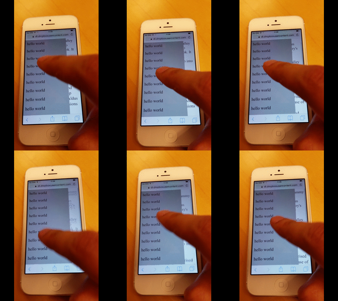
The next thing I did was apply the -webkit-overflow-scrolling CSS rule to the menu, which enables momentum-based scrolling.
As shown in the image below, the scrolling continues even after I swipe with my finger.
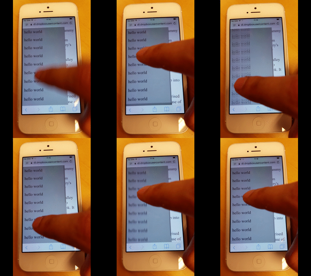
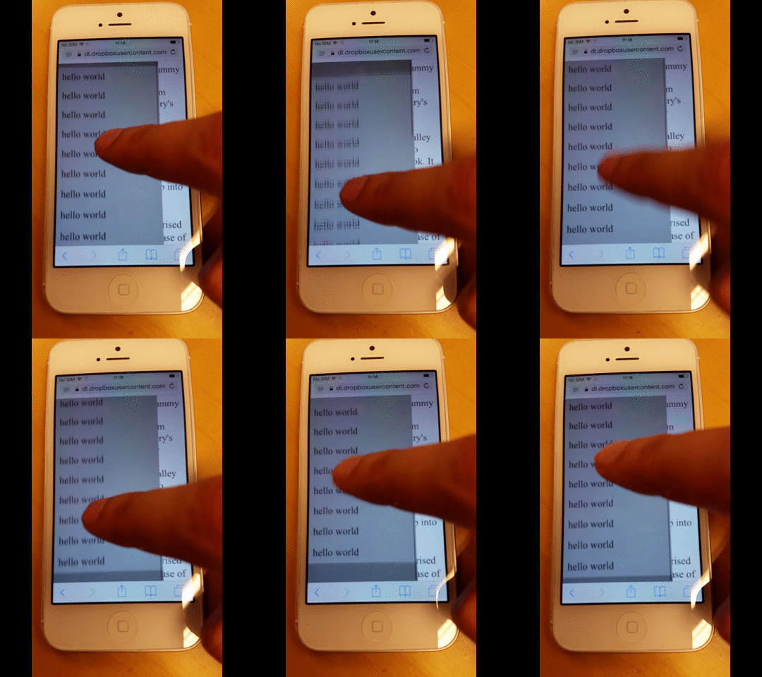
But it also adds a rubber-band effect when scrolling to the very top or bottom, as shown below.
The User Needs to Wait Until the Rubber-Band Effect Finishes
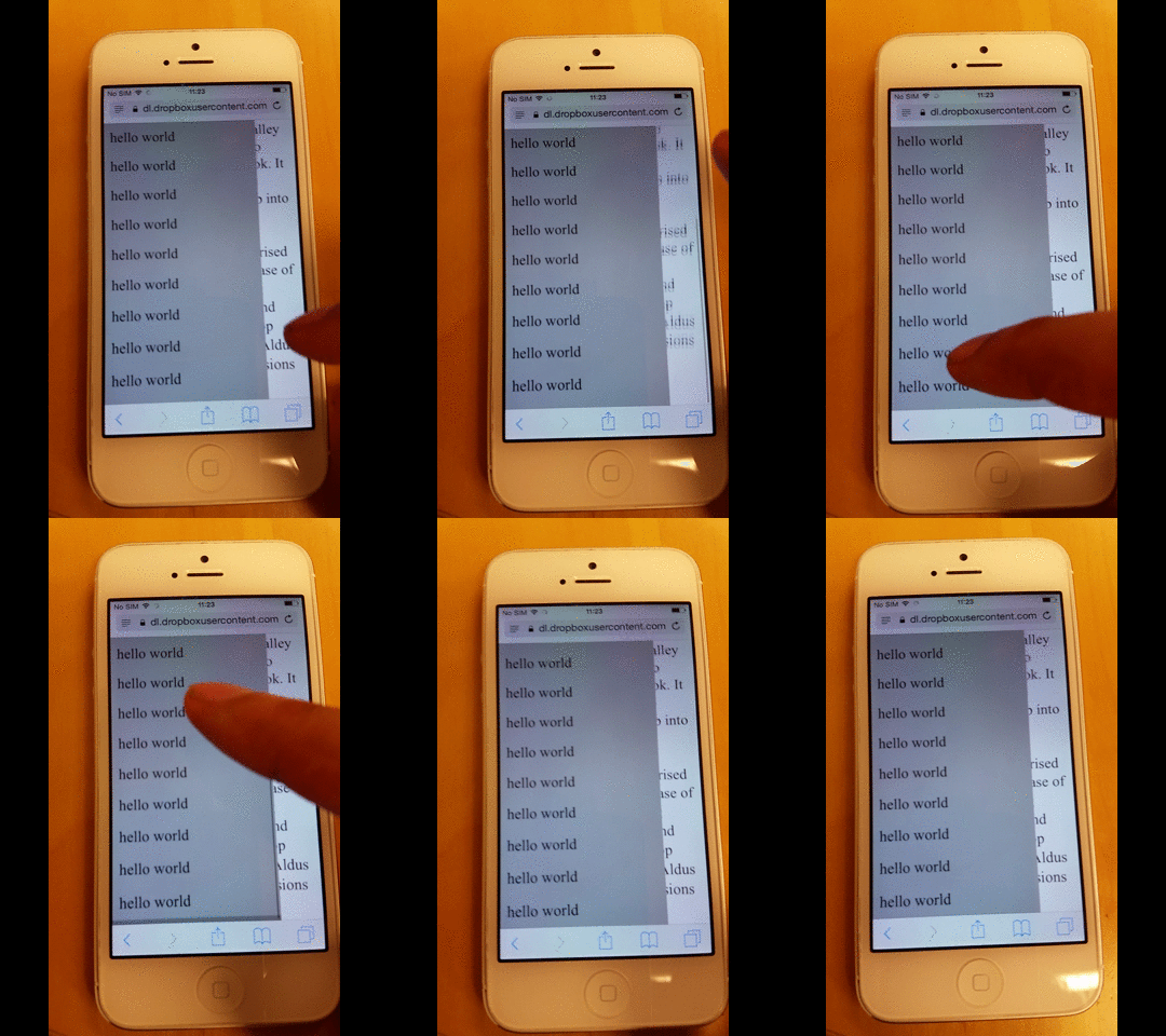
During my testing, I also noticed that while the rubber-band effect is in progress, the user cannot shift focus to another element until the animation has fully completed.
In the example below, I first scroll the background page and then quickly try to scroll the menu, but I end up continuing to scroll the background page instead.

However, if I wait a moment for the effect to finish, I can then start scrolling the menu.
How to Prevent the Background Page from Scrolling
During my testing, I also noticed that while the rubber-band effect is in progress, the user cannot shift focus to another element until the animation is completely finished.
Based on this answer from Stack Overflow, you can ensure that elements with disable-scrolling do not perform their default scroll action when the touchmove event is triggered.
document.ontouchmove = function(event) {
    var isTouchMoveAllowed = true,
        target = event.target;
    while (target !== null) {
        if (target.classList && target.classList.contains('disable-scrolling')) {
            isTouchMoveAllowed = false;
            break;
        }
        target = target.parentNode;
    }
    if (!isTouchMoveAllowed) {
        event.preventDefault();
    }
};
And then apply the disable-scrolling class to the page div:
<div class="page disable-scrolling">
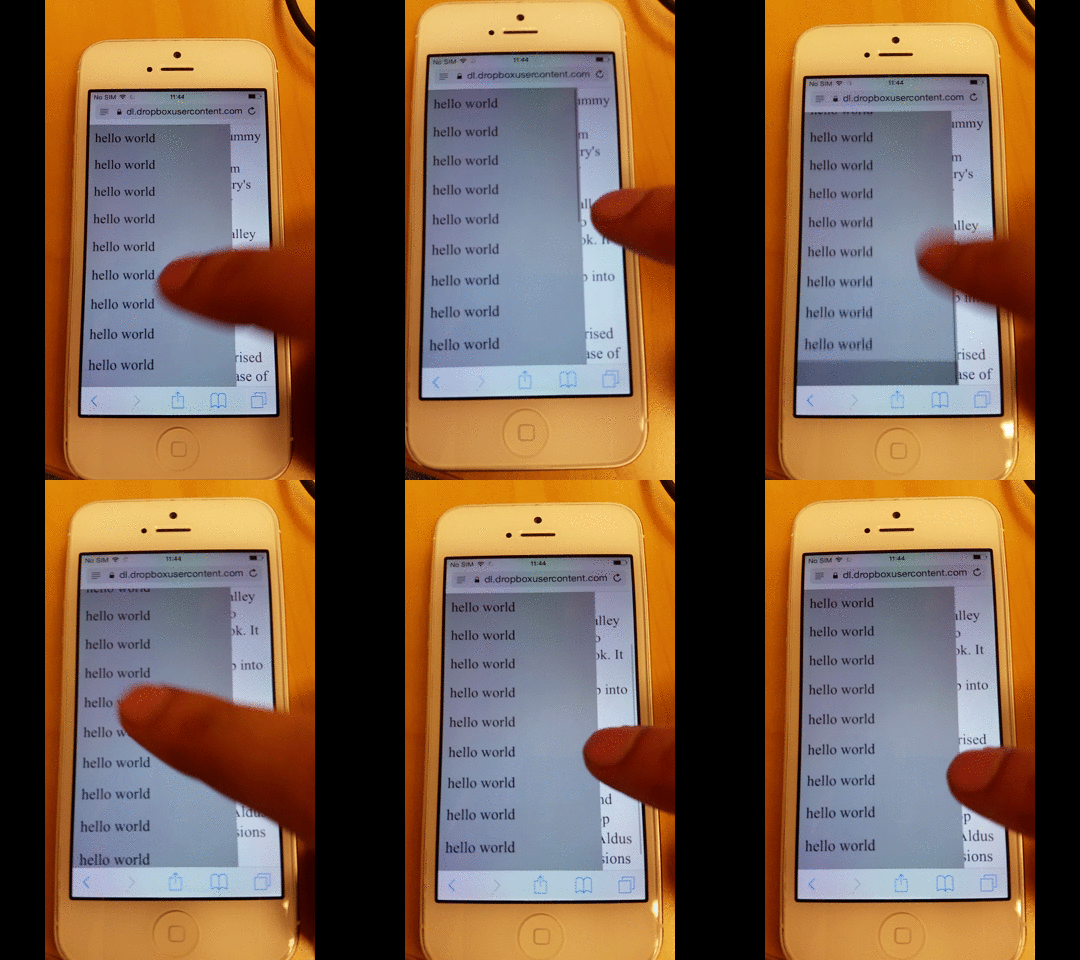
This kind of works, but more extensive testing shows that the background page can still sometimes scroll when you reach the very top or bottom of the menu.
How to prevent the over scrolling to the background page
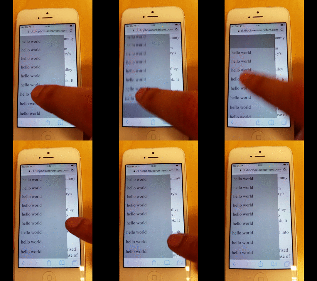
By applying this fix, it becomes possible to prevent "overscrolling". This means that when an element is scrolled to its very top or bottom, the scrolling does not continue into the body.
As a result, the body is prevented from scrolling, which also stops the rubber-band effect from occurring.
function removeIOSRubberEffect(element) {
    element.addEventListener("touchstart", function() {
        var top = element.scrollTop,
            totalScroll = element.scrollHeight,
            currentScroll = top + element.offsetHeight;
        if (top === 0) {
            element.scrollTop = 1;
        } else if (currentScroll === totalScroll) {
            element.scrollTop = top - 1;
        }
    });
}
removeIOSRubberEffect(document.querySelector(".scrollable"));
What this JavaScript snippet does is prevent the element from ever reaching the very top or very bottom by keeping it just 1 pixel away.
If the scroll position never reaches the absolute top or bottom, overscrolling can never occur.
How to Prevent Overscrolling to the Background Page
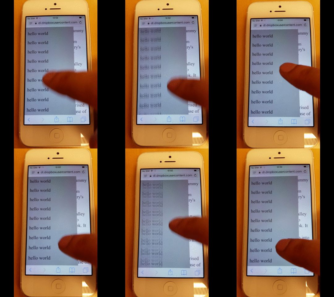
If you want to remove the rubber-band effect from the menu-either for aesthetic reasons or because, as in my case, it caused additional rendering glitches-simply remove the -webkit-overflow-scrolling CSS rule.
However, as you can see below, you also lose the smooth scrolling momentum.
Entire Page Source Code
Here is the full source code for the page.
<!-- License MIT, Author Special Agent Squeaky (specialagentsqueaky.com) --> <!doctype html>
                <html lang="en">
                   <head>
                      <meta charset="utf-8">
                      <meta name="viewport" content="minimum-scale=1.0, width=device-width, maximum-scale=1.0, user-scalable=no, initial-scale=1">
                      <meta http-equiv="Content-Type" content="text/html; charset=UTF-8">
                      <style> .page{ font-size: 24px; overflow: scroll; } .menu{ position: fixed; top: 0; bottom: 0; left: 0; width: 80%; background: gray; z-index: 1; font-size: 10px; overflow: scroll; /* uncomment to get smooth momentum scroll, but also a rubber band effect */ /*-webkit-overflow-scrolling: touch;*/ } .menu-item{ padding: 10px; background: darkgray; font-size: 24px; } </style>
                   </head>
                   <body>
                      <div class="menu scrollable">
                         <div class="menu-item">hello world</div>
                         <div class="menu-item">hello world</div>
                         <div class="menu-item">hello world</div>
                         <div class="menu-item">hello world</div>
                         <div class="menu-item">hello world</div>
                         <div class="menu-item">hello world</div>
                         <div class="menu-item">hello world</div>
                         <div class="menu-item">hello world</div>
                         <div class="menu-item">hello world</div>
                         <div class="menu-item">hello world</div>
                         <div class="menu-item">hello world</div>
                         <div class="menu-item">hello world</div>
                         <div class="menu-item">hello world</div>
                         <div class="menu-item">hello world</div>
                         <div class="menu-item">hello world</div>
                         <div class="menu-item">hello world</div>
                         <div class="menu-item">hello world</div>
                         <div class="menu-item">hello world</div>
                      </div>
                      <div class="page disable-scrolling">
                      Lorem Ipsum is simply dummy text of the printing and typesetting industry.
                      Lorem Ipsum has been the industry's standard dummy text ever since the 1500s,
                      when an unknown printer took a galley of type and scrambled it to make a type
                      specimen book. It has survived not only five centuries, but also the leap into
                      electronic typesetting, remaining essentially unchanged. It was popularised in
                      the 1960s with the release of Letraset sheets containing Lorem Ipsum passages,
                      and more recently with desktop publishing software like Aldus PageMaker including versions of Lorem Ipsum.
                      </div>
                      <script>
document.ontouchmove = function(event) {
    var isTouchMoveAllowed = true,
        target = event.target;
    while (target !== null) {
        if (target.classList && target.classList.contains('disable-scrolling')) {
            isTouchMoveAllowed = false;
            break;
        }
        target = target.parentNode;
    }
    if (!isTouchMoveAllowed) {
        event.preventDefault();
    }
};
 function removeIOSRubberEffect(element) {
    element.addEventListener("touchstart", function() {
        var top = element.scrollTop,
            totalScroll = element.scrollHeight,
            currentScroll = top + element.offsetHeight;
        if (top === 0) {
            element.scrollTop = 1;
        } else if (currentScroll === totalScroll) {
            element.scrollTop = top - 1;
        }
    });
}
removeIOSRubberEffect(document.querySelector(".scrollable"));
                      </script>
                   </body>
                </html>
